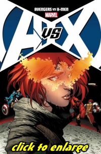
 The Phoenix has arrived, and the result is not quite what you would expect.
Issue #4 had the Avengers and X-Men locked in battle as they split up searching the 4 corners of the Earth for The Phoenix’s next host, Hope Summers. Hope and Wolverine formed an uneasy alliance that ended with Wolverine betraying Hope. Now as the two teams battle it out on the Moon’s blue area, Hope Summers begins to contemplate her true role in this cosmic event.
For a story that started out a little shaky, Issue #5 of Avengers VS X-Men pulls out all the stops. This issue not only moves the story forward, it’s also a game changer for the two teams. In addition to a major brawl in the 11th hour, some of the stories highpoints include; Wolverine’s promise to Hope, the unveiling of Tony Stark’s Phoenix contingency plan and last but not least, a bit of a curve ball as the phoenix takes its host( or make that hosts).
Issue #5 is written by Matt Fraction and I must confess he did a bang up job handling the storytelling on this one. Fraction’s use of Hope Summers as a narrator for this issue is a quality touch that demonstrates some emotional insight to her predicament. John Romita Junior is back handling the pencils. Interestingly, John’s art seems to be following the same pattern of development as the story. Romita Junior’s art carries a bit of a love hate relationship with fans. I for one am ok with his artwork. John has a strong grasp of layout and panel design that he combines with clear storytelling. Admittedly, some of his panels in the earlier issues were a little lackluster, but in this issue I feel he brought his A-game.
With the previous issues of the series, I have been pretty critical of the fragmented battle sequences. Crossover events usually have tie-in issues that bring other aspects of the story into emphasis. Conversely, this crossover’s tie-in books feature some of best match-ups and gripping story elements that should be taken in to appreciate the scale of this story. I will say that unlike other issues, the de-emphasis on the fight sequences had less of an impact on the story this time. Probably, due to the fact that the end of this one has such a shocking and welcome twist that eclipses everything else that has happened so far.
The revelation at the end of Issue #5 does an outstanding job of wrapping up the first story arch and charges the title with renewed energy as it moves into the next chapter.
Grade: A